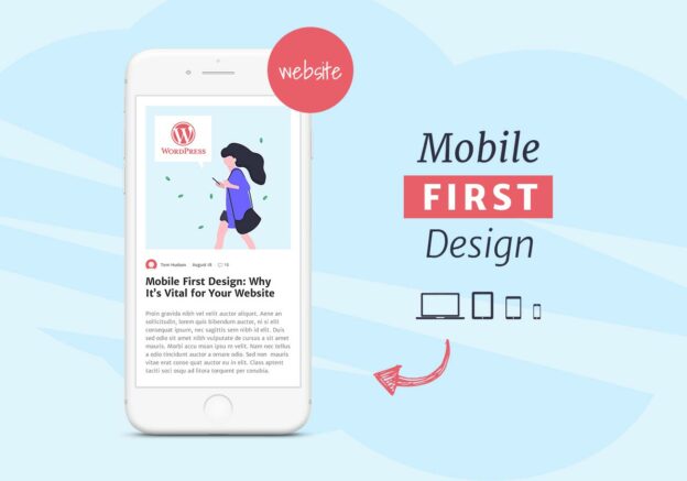
More than 80% of web traffic comes from mobile devices, and Google uses mobile-first indexing, meaning it primarily ranks your site based on its mobile version. If your WordPress site isn’t optimized for smartphones, you risk losing traffic, leads, and rankings.
Here’s a step-by-step guide to creating a mobile-first WordPress website that delivers speed, usability, and SEO benefits.
Contents
1. Choose a Mobile-Responsive Theme
Your theme determines how your website looks and functions across devices.
-
✅ Pick a lightweight, responsive theme (e.g., Astra, GeneratePress, Neve).
-
✅ Test the demo theme on mobile before installing.
-
✅ Avoid themes overloaded with animations or heavy scripts.
2. Use a Mobile-Friendly Page Builder
If you use a page builder, make sure it supports mobile editing.
-
✅ Elementor and Divi allow device-specific adjustments.
-
✅ Use Gutenberg blocks for a lightweight alternative.
-
✅ Check how content stacks on smaller screens.
3. Optimize Website Speed for Mobile
Mobile users expect fast-loading websites.
-
✅ Install a caching plugin (LiteSpeed Cache, WP Rocket).
-
✅ Compress images with WebP format.
-
✅ Enable lazy loading for images and videos.
-
✅ Use a Content Delivery Network (CDN) for global speed.
Mobile screens have limited space, so navigation should be simple.
-
✅ Use a hamburger menu for compact navigation.
-
✅ Keep menus short with only essential pages.
-
✅ Add sticky headers for quick access.
-
✅ Ensure buttons and links are easy to tap.
5. Focus on Readability and Content Layout
Long, unoptimized content is hard to read on small screens.
-
✅ Use short paragraphs and bullet points.
-
✅ Choose mobile-friendly fonts (14px–16px minimum).
-
✅ Add enough white space for easy scanning.
-
✅ Avoid pop-ups that block content on mobile.
6. Implement Mobile-First SEO
Since Google prioritizes mobile versions, optimize content accordingly.
-
✅ Ensure titles and meta descriptions fit mobile screens.
-
✅ Add structured data (schema) for better search visibility.
-
✅ Optimize images with descriptive alt text.
-
✅ Use AMP (Accelerated Mobile Pages) if needed for blogs.
7. Test Your Mobile Website
Always test before launch to ensure a smooth mobile experience.
-
✅ Use Google’s Mobile-Friendly Test.
-
✅ Check speed with PageSpeed Insights (mobile tab).
-
✅ Test across devices (iOS, Android, tablets).
-
✅ Ask friends or colleagues to test user experience.
FAQ
Q: What is a mobile-first website?
A mobile-first website is designed primarily for mobile users, ensuring fast speed, easy navigation, and responsive layouts.
Q: Do I need a special theme for mobile-first design?
No. Many modern WordPress themes are already responsive, but choose lightweight options for best performance.
Q: Can a mobile-friendly site improve SEO?
Yes. Google ranks mobile-optimized sites higher because of mobile-first indexing.
Q: Should I use AMP for my WordPress site?
AMP can speed up blogs on mobile but isn’t necessary for all sites. Use it if your audience is mobile-heavy.